Probability charts help estimators understand and evaluate the influence of input uncertainty on the risk associated with estimation outputs like schedule, effort/cost, or quality. Most of us understand that uncertainty regarding the assumptions an estimate is based upon increases the risk that our estimates will not match the final outcomes. Let’s use a simple, real-life example to illustrate this kind of risk.
Imagine that you are planning to adopt a family dog. Your children have their hearts set on a Beagle, and you want to have a bed, leash, tacky holiday sweater, and travel crate ready for your new best friend before heading off to the Daisy Hill Puppy Farm. You do some research and learn that Beagles range anywhere from 13-16 inches tall. Doing a little mental math, your estimate of the most likely height comes out to 14.5 inches tall, and you are 99% certain that the range of possible Beagle heights will fall within 13-16 inches. With such a narrow range of possibilities, picking a height right in the middle of that range means you are unlikely to be wrong by more than 1.5 inches either way. Because there is little uncertainty regarding Beagle heights, the risk of your estimate being wrong, reflected in both the magnitude of possible error (1.5 inches) and the consequences of being wrong (buying the wrong sized accessories), is quite small.
Now, imagine all you know before you head off to PetsSureRXpensive! is that you’re going to adopt a dog of unspecified breed. Because you have far less specific knowledge, the potential range of dog heights is MUCH broader – anywhere from 6-44 inches! Splitting the difference, you might estimate the most likely height for your new pal to be about 25 inches. But because the uncertainty range is so much larger, your estimate could be off by as much as a foot and a half!
With this real-life example, we can see that uncertainty surrounding our estimation inputs (the range of possible dog heights) very much affects the risk that our estimate will differ from the actual height of our new best friend.
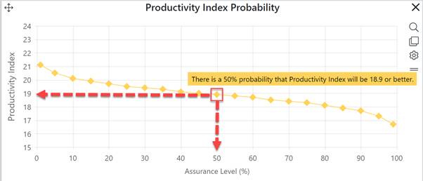
Based on the uncertainty slider positions for current solution inputs (size, PI, and labor rate), these charts show the range of potential values for major management metrics on the vertical axis, with the corresponding Assurance levels or probabilities (expressed as percentages) of achieving each outcome on the horizontal axis.

The range of potential outcomes is generated by varying current solution inputs (size, PI, and labor rate) throughout the 99% confidence interval specified using the uncertainty sliders. In the example below, the expected PI is 18.9. This is the PI value used to calculate the current solution. To produce a range of potential solutions, SLIM-Collaborate uses Monte Carlo simulation to vary each solution input across its 99% confidence interval (16.7 to 21.1, in the case of PI). A distribution of possible outcomes is created. More uncertainty produces a wider range of outcomes. Reducing uncertainty narrows the range of outcomes.

At the center of this distribution lies the current solution. Because it is based on exactly one likely or expected input value for PI, size, and labor rate, the uncertainty range doesn’t affect the current solution. Instead, the uncertainty drives the range of possible solutions as each input is varied within its associated range of possible values.

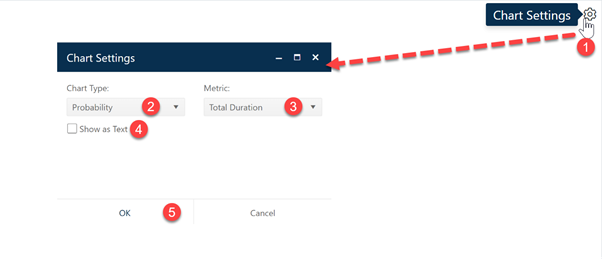
To create a Probability Chart, go to an existing chart or report (or a blank dashboard slot) and click the Chart Settings icon. On the Chart Settings dialog, select Probability from the Chart Type combo box. The fields available for configuring will update as you select different chart or report types.

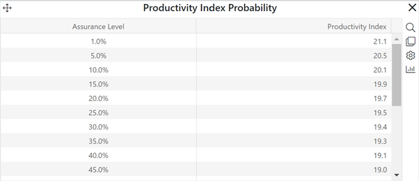
Next choose the Metric you wish to display on your Probability chart. Finally, decide whether you wish to display the chart or report form (Show as Text). When the chart settings are configured to your satisfaction, click OK to exit the Chart Settings dialog and display your new Probability chart.

The resulting probability chart will show the range of possible inputs (when the metric displayed is PI, or size – inputs to Monte Carlo simulation) or outputs (duration, end date, effort, cost, or MTTD when the metric displayed is an output of the Monte Carlo simulation).
The report form makes it easier to read off the values associated with various assurance levels and is useful for exports to PDF, PowerPoint, and Excel.

Remember: probability charts are always calculated in relation to the expected or 50% solution and the uncertainty surrounding inputs to that solution. The calculated probabilities are meaningless in relation to solutions other than the current solution and are not used to calculate fixed percentage contingency solutions.
For guidance in using other chart or report options specific to the Contingency dashboard, see the following topics.