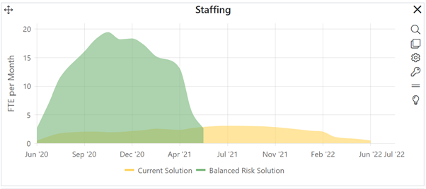
Time series charts make it easy to compare monthly effort, cost, staffing, code construction, or error values (in rate or cumulative form) over time for projects in the estimation stage. Because most organizations do not record actual (as opposed to estimated) monthly data for completed projects, Closeout dashboards do not have time series charts.

As with other estimation and contingency dashboard charts, the current solution is always yellow, Balanced Risk Solutions are green, Comparison (logged) solutions are blue, and Contingency solutions are grey.
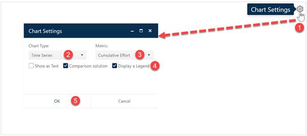
To create a Time Series chart, go to an existing chart or report (or a blank dashboard slot) and click the Chart Settings icon. On the Chart Settings dialog, select Time Series from the Chart Type combo box. The fields available for configuring will update as you select different chart types.

Next choose the Metric you wish to display on your Time Series chart. Finally, decide whether you wish to display the chart or report form (Show as Text), toggle the display of comparison (Logged and Balanced Risk) on or off, and show or hide the Legend, When the chart settings are configured to your satisfaction, click OK to exit the Chart Settings dialog and display your new Time Series chart.