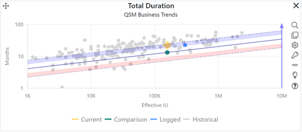
A trend chart shows selected key project metrics on a scatter plot with size as the X-axis (independent) metric. This type of chart is useful for seeing how far out of line a metric is from the expected average (trend) value. Trend charts are available on both the Estimation and Contingency dashboards. They differ only in the Comparison solutions they can be configured to display alongside the Current solution:
•Estimation trend charts can show the Current, Balanced Risk, Logged, and Historical comparison solutions.
•Contingency trend charts show the Current solution vs. a selected Contingency solution.

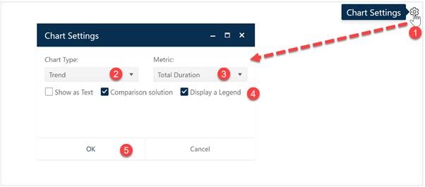
To create a Trend chart, go to an existing chart or report (or a blank dashboard slot) and click the Chart Settings icon. The settings you see will vary slightly, depending on whether you are configuring an Estimation trend chart or a Contingency trend chart.
On the Chart Settings dialog, select Trend from the Chart Type combo box. The fields available for configuring will update as you select different chart types and will also differ slightly, depending on whether you’re working with an Estimation dashboard trend chart or a Contingency trend chart.

Next, choose the Metric you wish to display on the Y-axis of your Trend chart (the X-axis metric is always Size). Use the Show as Text checkbox to display your Trend chart in either chart (scatterplot with trends) or report form (grid).
For Estimation trend charts, use the Comparison solution checkbox to toggle the display of comparison solutions on or off. If the trend chart is on an Estimation dashboard, multiple Comparison Solutions (the Balanced Risk and all logged solutions) will be displayed. Trend charts on Contingency dashboards can be configured to show the Current Solution and/or a single Contingency profile solution. Historical comparison solutions will only be displayed on Estimation trend charts (and only when a Historical solutions filter is selected via the Historical Solutions icon in the Estimation dashboard toolbar. The following symbols and colors are used to denote various solution types:
•Current solution. Yellow diamond.
•Contingency solution. Grey square.
•Balanced Risk solution. Green circle.
•Comparison (logged) solutions. Blue square.
•Historical solutions (estimation trend charts only). Grey circle.
A Legend will be displayed by default – to toggle it off simply uncheck the Legend field. When the chart settings are configured to your satisfaction, click OK to exit the Chart Settings dialog and display your new Trend chart.
If you change your mind about any of the original settings,
use the Chart Icons toolbar located at the right side of the
chart to change the metric displayed or change other chart options. If the chart
icons toolbar is not visible, you can show/hide it using the eyeball icon ( ) in the dashboard toolbar.
NOTE: The Legend on trend charts is interactive – you can toggle the display of various solution types on or off by simply clicking the desired solution type in the legend. In the screen snap below, the left-hand chart has Logged solutions toggled “off” via the legend – note that the legend text is greyed out and no blue square symbols are shown. The chart on the right has Logged solutions toggled on.
