When you have finished reviewing project settings and
filling out the Assumptions, click the OK button to generate a current
and balanced risk solution, show an overall risk assessment for the current
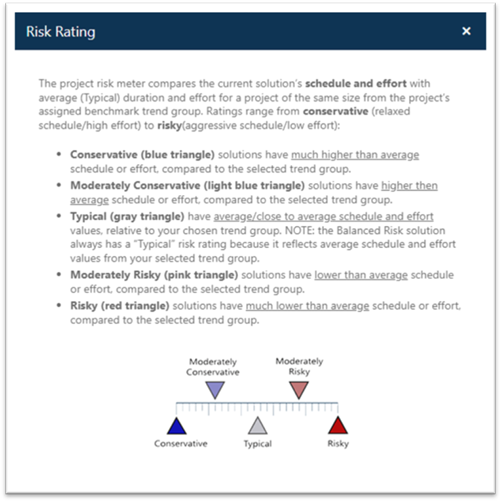
solution (look at the risk meter in the center of the project toolbar).
If you rest your cursor over the risk meter, a tooltip will show the risk
rating.

Clicking the risk meter brings up a detailed description of
each risk rating.

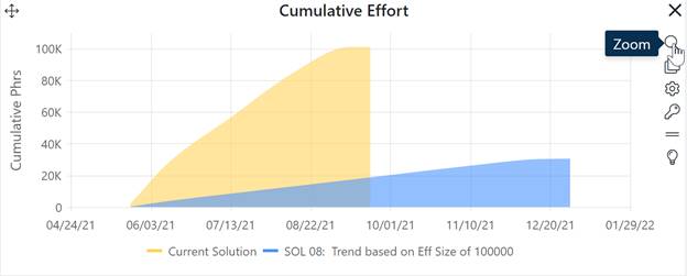
What you see on the project dashboard will depend on the dashboard displayed, but in general, the Current Solution is shown in yellow and the Balanced Risk solution is displayed in green. If you have chosen a solution other than the Balanced Risk solution as your comparison solution, that solution will be displayed in blue on charts and reports. Logged solutions are also displayed in blue on Comparison and Trend charts.
To see a larger version of any chart or report, simply click the Zoom (magnifying glass) icon on the chart controls toolbar.

When you are finished with the zoomed chart, click the Unzoom icon again to restore it to the original size and position on the dashboard. For more detailed guidance on using the project dashboards, see the Project Dashboard Charts and Reports and Dashboard User Interface topics in this user guide.
You can use the Risk, Trend, Comparison (Bar), Time Series, or Milestone charts or reports and the Project Overview, Solution Summary, Solution Assumptions, and Size Details Reports to evaluate the Current, Balanced Risk, or Comparison solutions against two criteria:
•Which solution best satisfies our staffing, schedule, and cost goals?
•Which solution is most reasonable (least risky) compared to your chosen trend group?
To display multiple charts on the same view, use the Estimation or Contingency Dashboard links to view previously created dashboards or create a new one. Additional information about the project risk rating, working with single charts and reports, and the dashboard appear in the following sections.