
New Dashboard. This icon creates a new, blank
dashboard. Configure up to 16 charts or reports per dashboard, then save
your work using the Save Dashboard icon.

Save Dashboard. Use this icon to save new or
modified dashboards. When the current dashboard is empty (contains no
charts or reports), the Save Dashboard icon will be disabled until
at least one chart or report has been configured. Empty dashboards
cannot be saved. The save options available to you will depend on
the permissions in your user role. For more information about available
settings, see Creating a New Dashboard and Dashboard Save
Options.

Column Layout. Click to change the number of
columns per dashboard and resize all charts/reports on the current
dashboard. This setting is preserved when you save the
dashboard.

Comparison Solution. (Estimation dashboards
only). A Comparison solution is simply a single Balanced Risk or logged
Estimation project solution displayed next to the
Current Solution on charts and reports for comparative analysis.
Clicking this icon brings up the list of logged solutions for the
current Estimation project. The Balanced Risk solution (a default,
automatically generated solution that reflects average schedule/effort
performance from the current trend group) will also appear in the list. If
the current project has no logged solutions, this icon will not
appear.
Once you select a single solution from the list, it
displays on all charts/reports configured to show a Comparison
Solution. Because the Comparison solution is a project attribute (a
benchmark, so to speak), changing the comparison solution causes the
Project is Modified banner to be displayed and a save prompt will appear
if you leave the project page before saving the project.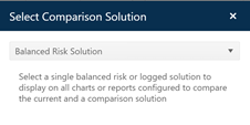

Historical Solution Selector. (Estimation dashboards only) Select a public filter to display a group of relevant completed projects for validation and comparison purposes on trend charts.

Manage Dashboards. This button loads the
Manage Dashboards grid into the dashboard area of the project page,
replacing the current dashboard. Once you have finished working with the
Manage Dashboards grid, use the Return to dashboard link to restore
the dashboard content if desired.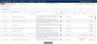

Show/Hide Chart Icons. Click the eye icon to
instantly show/hide Chart Icons. This toggle will be applied globally to
all dashboards of the type you are currently using (project or portfolio).

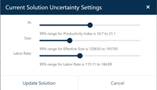
Uncertainty Slider. (Contingency dashboards
only). Uncertainty sliders are Contingency Dashboard controls used to
set the amount of uncertainty surrounding the key inputs to an
estimate (Size, PI, Labor rate). Moving the slider bar
from left to right provides a 99% confidence interval for the estimated
size, PI (productivity), or labor rate.
The uncertainty range for each input varies from 0 at the
extreme left side of the scale (indicating you are certain of the exact
input value) to a maximum variance at the right end of the
scale. Slider bars should be positioned to reflect 99%
confidence that the true value of each input will not fall outside the
displayed range. Slider bar adjustments do NOT affect the
current solution – they are only used to calculate probability
chart/report distributions and the appropriate amount of risk buffer
(contingency solution) for target probability profiles.

Export to PDF. Click this icon to export the current dashboard to PDF format for electronic data exchange or printing. Charts will print one to a page, in the order they are arranged on your dashboard. Multipage reports will be printed to successive pages.

Export to PowerPoint. Click to export all charts/reports on the current dashboard to PowerPoint. Charts and reports will be exported one-to-a-slide, in the order they are arranged on the current dashboard.

Export Reports to Excel. Click to export all reports on the current dashboard to Excel. Note that charts cannot be exported to Excel – if no reports are present on the current dashboard, a message will inform you that the export cannot be completed.