The metric you choose from the Metric combo will be displayed on the vertical or y-axis of the benchmark trend chart. It will also be used to calculate a five-star metric rating for individual projects from your portfolio. Available metrics are:
•PI
•Phase 3 metrics (Effort, Staff, Duration, Avg. Construction Rate, or Productivity)
•MTTD
•Defects SIT-DEL
Because the average values for most software metrics vary with project size, your selected metric will appear on the vertical axis of the chart with project size along the horizontal axis. Projects sized in different functional sizing units are normalized to the default sizing unit defined by your site administrator (usually IUs, or Implementation Units). For example, if you select “PI”, the scatter plot chart will display PI (vertical axis) vs. Size (horizontal axis) and the five-star metric ratings will indicate how each project’s PI value compares with the PI vs. Size benchmark trend from your selected benchmark trend group.
Choosing a Trend
The Trend combo box shows all trends available on your SLIM-Collaborate site as well as the “Most Common Trend” (the most commonly used trend group for the current filtered group of projects).
You can use a QSM default trend group or, if your back-office person has provided them, any custom benchmark trend calculated using data from your organization. To use the trend group most frequently associated with the projects you are benchmarking, select Most Common Trend. For more information about the QSM reference trend groups, see the QSM trend groups and Trend Group Metrics topics in this user guide. Contact your site or back-office person for guidance about customs and internal benchmarks from your organization.
If desired, you can adjust the Shading Style and the Data Labeling options for your trend chart.
Selecting a Shading Style

The shading style is used to highlight regions of variation around the selected benchmark trend lines. The shaded regions around each metric trend line provide a visual reference for assessing how each project positions, relative to the average regression line and to the other projects in the benchmark trend sample. For example, the 1-star region contains the bottom 20% of ranked projects from the benchmark reference trend for the selected metric. 2 stars show the 20th - 45th percentiles, 3 stars show the 45th-70th percentile region, 4 stars correspond to the 70th -90th percentile, and 5 stars represent the top 10% of ranked projects from the benchmark trend.
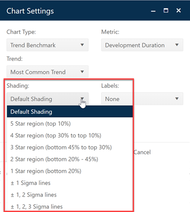
To explore the effect of applying various shading styles to a trend chart, expand the Select Style list to see the various shading options. You can select from among the following display options:
•Default shading – displays the average regression line and +- 1 sigma lines and highlights the 2-, 3-, and 4-star regions.
•5 Star Region displays the +/- 1, 2, or 3 standard deviations from the regression line and shades projects in the top 90%
•4 Star Region displays the +/- 1, 2, or 3 standard deviations from the regression line and shades the top 70-90% of projects.
•3 Star Region displays the +/- 1, 2, or 3 standard deviations from the regression line and shades the 45th-70th percentiles.
•2 Star Region displays the +/- 1, 2, or 3 standard deviations from the regression line and shades the 20th-45th percentiles.
•1 Star Region displays the +/- 1, 2, or 3 standard deviations from the regression line and shades the 0-20th percentiles.
•+- 1, 2, or 3 Sigmas options display the +/- 1, 2, or 3 standard deviations from the regression line with no shading.
Once the chart shading is displayed, hover tips will display additional information as you rest the cursor over regression lines or data points.
Data Label Options
You may display just the data points (no labels), the
project ID, or the project name.
NOTE: when data labels are displayed in
conjunction with a large number of projects, trend benchmark charts and reports
can take a long time to render (especially if more than one is placed on a
view). The labels themselves can also obscure the data points or other data
labels when space is tight, or data points are located close together. Should
you encounter performance or display issues with these charts, try limiting the
number of projects displayed by filtering the project list prior to using views
or choose the No Label option.