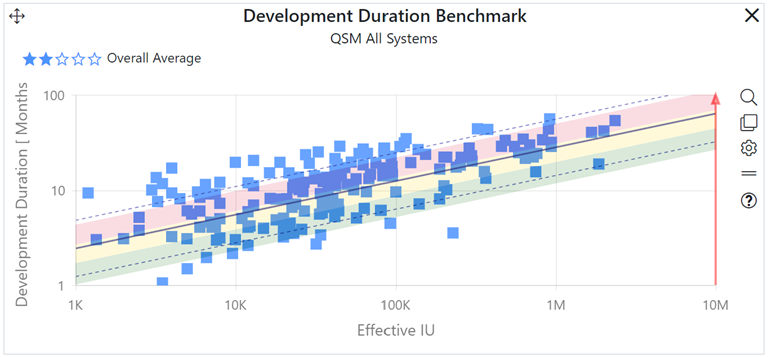
The trend benchmark chart provides a mechanism for reviewing the values of a selected metric (relative to project size) against a specific QSM industry trend or a custom trend created from your own projects.

The trend benchmark chart allows you to benchmark completed project performance against QSM industry or custom benchmark trends created using your own projects. Individual projects are plotted as blue squares on a scatterplot chart. The selected regression trend average and +/- one, two, or three standard deviation lines are also shown, allowing you to easily see how each project positions, relative to the benchmark trendlines. High-level, “at-a-glance” benchmark information is also provided an overall “five-star rating” for the entire sample.
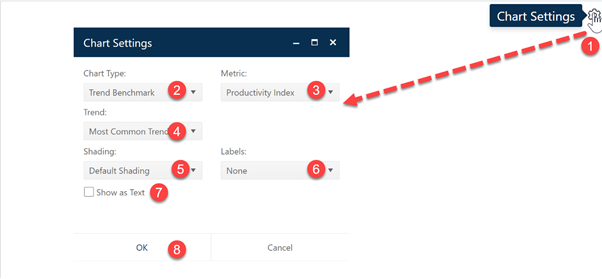
To create a Trend Benchmark chart, go to an existing chart or report (or a blank dashboard slot) and click the Chart Settings icon. On the Chart Settings dialog, select Trend Benchmark from the Chart Type combo box. The fields available for configuring will update as you select different chart types.
