 on the dashboard control menu to view the
chart size and column layout options.
on the dashboard control menu to view the
chart size and column layout options.SLIM-Collaborate provides three dashboard column layout
options. Click on the Column Layout icon  on the dashboard control menu to view the
chart size and column layout options.
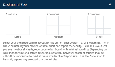
The current dashboard layout is Medium, 2 columns. Each grid option provides placeholders for up to 16 charts/reports.
Click on the 3 columns grid option to display the dashboard in 3-column layout. Now, let’s add a chart by configuring the first available empty chart slot.
Click on the chart options icon  in the empty cell beside the
Productivity Index trend chart to configure a new chart. The Chart
Settings dialog provides a variety of chart types and metric options. You
can toggle any chart to report format by clicking the Show as Text
checkbox.
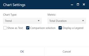
Change the Chart Type to Comparison and Metric to Total Avg Staff. Comparison charts show metric values for the Current (gold), Balanced Risk (green), and all logged solutions (blue).
Use the Duplicate Chart icon  on the new Comparison chart to
insert a copy of this chart into the next available empty slot on the
dashboard. Click the Chart Settings (gear) icon on this chart
and change the Metric to Defects SIT-DEL.
Change the Metric on the Staffing time series chart
in the upper left corner of the dashboard to display Cumulative
Cost. Your dashboard should look like the screen snap
below.
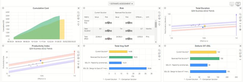
You can select the eye  icon to hide the chart icons toolbars
for all charts on the dashboard. Use the Log Current Solution (push
pin) icon
  to add the current solution to
the log, accept the default name, and set the Solution Workflow Status to
Revised Estimate. The Current Solution is logged as Sol 03.
SLIM-Collaborate computes risk by comparing solution values like productivity, schedule, effort/staff/cost, or quality to averages for projects of the same size in the associated trend group. In the Feasibility solution, the Balanced Risk solution is used for comparison because the focus is on the reasonableness of the desired outcomes compared to average performance. You have the option of selecting any logged solution for comparison on most charts and reports. Each solution’s risk assessment is computed against trend group averages, but now you can compare the relative riskiness and reward of alternative solutions based in individual metrics.
Since Phillip is recommending a new solution, he wants to
highlight the advantages over the proposal team and alternative estimates.
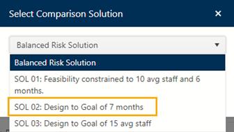
SLIM-Collaborate lets you select any logged solution as the comparison
solution. Click the lightbulb icon  in the dashboard toolbar and select
Sol 02 Design to Goal 7 of months as the comparison solution.
Comparing solutions side by side makes it easy to identify the tradeoffs. The proposal team’s estimate (SOL 01) required a much higher than average productivity to achieve the goals of delivering in 6 months using 10 people. Phillip’s analysis against industry trends and Rintell history indicated that would be too risky, so he computed a solution to determine the staff required to meet the 7-month schedule based on the industry average PI (Sol 02) – over 30 people! SLIM-Collaborate shows the non-linear tradeoff between time and effort modeled by QSM’s Software Production Equation. Schedule reduction is costly. Phillip’s third estimate solution (SOL 03: Design to Goal of 15 avg staff) shows what the schedule would be if they could add a few more people.
Let’s use the dashboard to analyze these solutions:
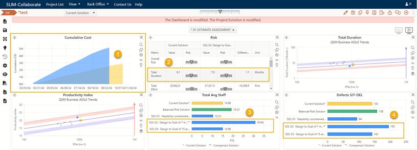
1. The Cumulative Cost chart (top left, below) shows that the 15 avg staff solution is $2M cheaper.
2. The Risk chart shows that this option only extends the proposed schedule by 2 months (8.1 months instead of 6 months). Negotiating for more time delivers huge cost savings!
3. The “more time” strategy also frees up staff to work on other projects.
4. But
best of all, product quality is also improved by reducing potential
defects.
Another alternative, of course, is to reduce the scope. Since this project will employ Agile development methods, there is a good possibility that the prioritized backlog will help the team deliver a viable, consumable release that is smaller than the estimated size of 1247 Story Points. After comparing the logged solutions, Phillip is ready to recommend Sol 3: Design to Goal of 15 avg staff as the best option.
The pink banner across the top of the page reminds you that both the dashboard and project have been modified. Phillip wants to share his analysis with the team, so he’ll save this edited dashboard as a new public dashboard. This way, he won’t overwrite another shared public dashboard used by other teams.
Save the Project, then click the blue Save Dashboard
 icon on the dashboard toolbar. When
the Save Dashboard dialog appears, select the Folder pull-down menu to
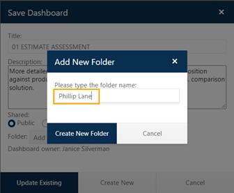
Add New Folder and name it Phillip Lane. Change the
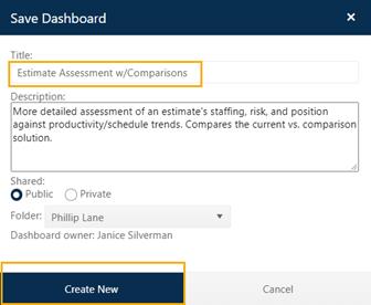
dashboard Title to Estimate Assessment w/Comparisons and click on
Create New to save Phillip’s new dashboard into a dedicated folder.
SLIM-Collaborate lets stakeholders create public and private dashboards depending upon their permission levels. For more information see Managing Dashboards.