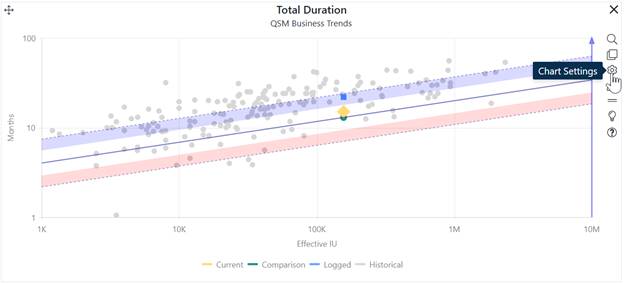
The Trend chart plots Current, Comparison or Balanced Risk, Logged, and/or Historical solutions, relative to trend lines from the project’s primary trend group. Trend Charts show solution values for a single selected project metric (duration, effort, average staff, and productivity) vs. project size. Use the pull-down menu in the chart settings to display the desired metric on the trend chart. You can toggle the chart to report form using the chart settings toolbar or bring up the project settings dialog and use the checkboxes provided.

Click on the question mark icon at the bottom of the chart icons toolbar to see a chart interpretation guide. Note where the Current solution (yellow diamond) and Balanced Risk solution (green circle) or Comparison and/or logged solutions (blue squares) are positioned, relative to the average trend line and shaded risk regions. You can toggle the display of various solutions on or off by clicking the corresponding legend item. For example, to hide the Historical solutions, click Historical solutions. The chart now shows only the Current, Comparison, and Logged solutions and the text for the Historical legend item appears greyed out.

As you rest the cursor over various chart elements, hover tips display information about the indicated item. In the example shown here, Total Duration for the Current solution is slightly above the trend line in the white (typical) region: between zero and one standard deviations above average. The Balanced Risk solution sits directly on the trend line. The Current solution assumes more time than the trend indicates would be typical for systems of the same size: hence, it is a less risky solution in the sense that most projects from your selected trend group would need less time to deliver the same scope.
Notice the blue arrow on the right vertical axis. The color of the arrow indicates that “safer” values for the selected metric will be in the direction of the arrow (higher). The corresponding blue risk region above the average trend line also indicates the region where moderately conservative (i.e., less risky or risk buffered) solutions would position.
The same color cues are used to indicate the direction of greater risk. If the arrow on the y-axis is red, solutions that position higher up the vertical axis are riskier.