Time series charts show aggregated monthly or cumulative staff, effort, or cost values over time for the projects in your portfolio. In previous versions of SLIM-Collaborate, if the number of projects included for analysis was relatively small SLIM-Collaborate would associate a color with each project and “stack” the values. This feature was discontinued in SLIM-Collaborate 4.0. Now, only aggregated monthly values are shown.
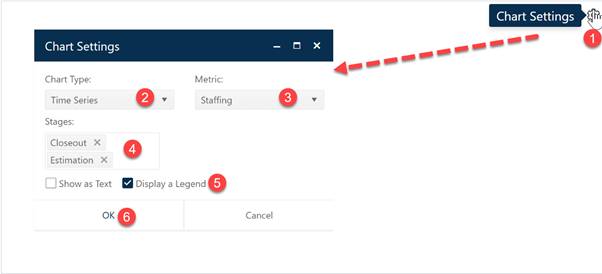
To create a Time Series chart, go to an existing chart or report (or a blank dashboard slot) and click the Chart Settings icon. On the Chart Settings dialog, select Time Series from the Chart Type combo box. The fields available for configuring will update as you select different chart types.

Next choose the Metric you wish to display on your Time Series chart. If desired, you can limit the data in the chart to projects in a single Stage or select both Estimate and Closeout to display data from all projects in your current project list filter. Next, decide whether you wish to display the chart or report form (Show as Text). A Legend will be displayed by default – to toggle it off simply uncheck the Legend field. When the chart settings are configured to your satisfaction, click OK to exit the Chart Settings dialog and display your new time series chart.

If you change your mind about any of the original settings,
use the Chart Icons toolbar located at the right side of the chart to
change the metric displayed or limit the projects considered to those in a
particular stage. If the chart icons toolbar is not visible, you can show/hide
it using the eyeball icon ( ) in the dashboard toolbar.