For a more detailed view of solution risk, select the DETAILED RISK ASSESSMENT dashboard from the dashboard selector control at the top center of the project dashboard. The Risk chart and report display relative risk ratings for the Current and Balanced Risk or Comparison solution. For each metric shown, a risk rating is calculated by comparing the value of each metric to the average for similarly sized projects from your chosen trend group.

On the Risk Chart, risk ratings for the Current and Balanced Risk or Comparison solutions are displayed side by side. A Difference column on the right side of the chart shows the delta (difference) between the two solutions. To read each risk assessment, look at the triangle symbol in the middle. If the triangle is pale or dark blue, that metric value is conservative. Grey triangles denote average risk. If the triangle is pink or red, the solution is risky.

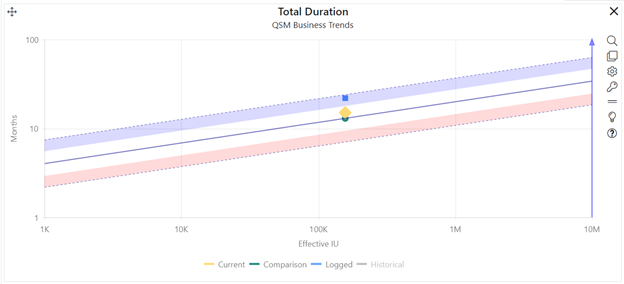
On the risk chart shown here, the overall risk rating is Risky, as indicated by the red triangle in the first row. Note the contrast between the Current solution risk ratings and the Balanced Risk solution ratings. The Productivity Index (PI) risk triangle for the Current solution is blue, which means this solution assumes a fairly typical productivity value for a system of this size. But the effort is not at all typical: this solution uses far less effort than similarly sized projects in the project’s chosen reference trend group. The duration is longer than a typical project in the comparison trend group. If you are using industry data to assess project risk and this level of productivity, staff, and schedule have been successfully implemented in the past, a plan like this may succeed. The risk is that using so much more effort will have a negative effect on quality at delivery (large teams are highly correlated with defect creation and poor quality). But the Balanced Risk solution (average productivity, a longer schedule, and a team that’s over twice as large) reflects average productivity, schedule, and resources for projects of this size in the project’s chosen trend group.
The Difference column adds context: relative to the Balanced Risk solution, the Current solution uses fewer FTE staff and fewer effort hours than is typical for a system of this size. SLIM-Collaborate’s side by side risk bars make it easier to spot potential tradeoffs and generate more reasonable and achievable plans.
On the non-zoomed version of the chart or report, you can toggle the chart to report form using the Show as Text icon or the checkbox in the project settings and show or hide the Comparison Solution via the Comparison Solution checkbox or Show/Hide Comparison solution icon in the chart settings toolbar.