Risk charts and reports, available only on the Estimation dashboard, provide both summary and detailed risk assessments for major project metrics like schedule (duration), staffing (team size), effort, cost, productivity, and quality.

For each metric, a risk rating is calculated by comparing the current or comparison solution value to the average for similarly sized projects from your chosen trend group. Risk ratings for the Current and Balanced Risk or Comparison solutions can be displayed side by side. A Difference column on the right side of the chart shows the delta (difference) between the two solutions.
To read chart risk assessments, look at the triangle symbol in the middle of the risk gauge. A hover tip explains each rating. If the triangle is pale or dark blue, that metric value is conservative, compared to the project’s chosen trend group average. Gray triangles denote average risk consistent with trend average values. If the triangle is pink or red, the solution value for that metric is risky (significantly lower or higher than the trend average).
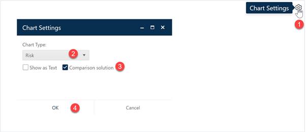
Risk charts can help you identify solution assumptions that are out of line with industry or your own performance trends. To create a Risk chart, go to an existing chart or report (or a blank dashboard slot) and click the Chart Settings icon. On the Chart Settings dialog, select Risk from the Chart Type combo box. The fields available for configuring will update as you select different chart types.

Next, decide whether you wish to display the chart or report form (Show as Text). To display a comparison solution, check the Comparison Solution checkbox to calculate risk ratings for the project’s current Comparison Solution (Balanced Risk or a solution from the log) as well as the Current solution. When the chart settings are configured to your satisfaction, click OK to exit the Chart Settings dialog and display your new Risk chart.
If you change your mind about any of the original settings,
use the Chart Icons toolbar located at the right side to adjust
the chart settings. If the chart icons toolbar is not visible, you can show/hide
it using the eyeball icon ( ) in the dashboard toolbar.