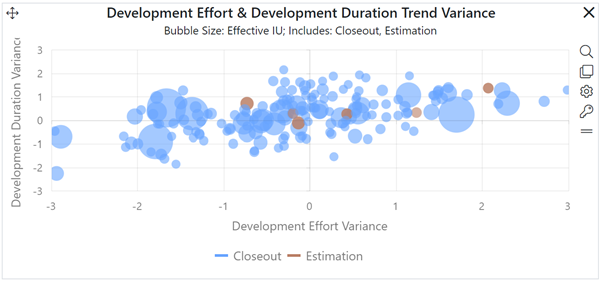
Quadrant charts position each project in your portfolio against two metric regression trends from the benchmark trend group defined in each project’s settings. A quadrant chart is divided into four equally sized regions. The lines separating the four quadrants represent average performance trends for the X (horizontal) and Y (vertical) axis metrics at each project’s delivered or estimated size. Projects are depicted as circular dots (bubbles).
The location of each bubble indicates how far each project’s metric value falls from the project’s average trend line. Bubbles positioned above or to the right of the trend averages (dividing lines) have higher than average metric values. Those below or to the left of the dividing line have lower than average metric values.

In addition to the X and Y axis metrics, a third metric is used to scale the size of the project “bubble” according to its relative value. Quadrant charts can also display a target zone to help you identify regions of acceptable variation from industry or internal performance trends (e.g., projects that lie within a certain number of standard deviations from each average trend). To change the default target zone (±1 standard deviations), enter the Min and Max number of Standard Deviations for both the Horizontal and Vertical Axis metrics. SLIM-Collaborate will also allow you to add labels to the four quadrants if you so desire.
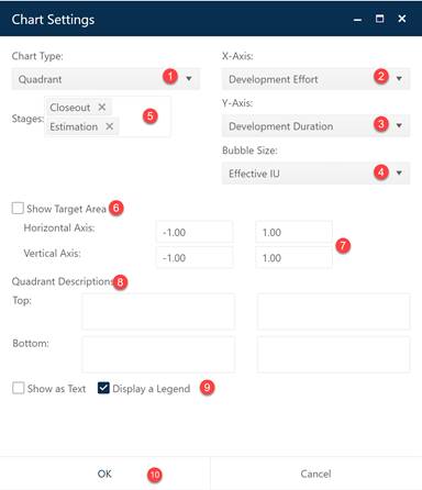
To create a Quadrant chart, go to an existing chart or report (or a blank dashboard slot) and click the Chart Settings icon. On the Chart Settings dialog, select Quadrant from the Chart Type combo box. The fields available for configuring will update as you select different chart types.

Next choose the X- and Y-Axis metrics you want to display using the appropriate combo boxes. The third metric combo box, Bubble Size, lets you choose the metric for scaling each project’s bubble size. If desired, you can limit the data in the chart to projects in a single Stage or select both Estimate and Closeout to display data from all projects in your current project list filter.
To display a Target Zone region on the chart, check the Show Target Area checkbox. You can override the default target zone settings (+- 1 standard deviation), by entering Min and Max variance values for both the X and Y axis metrics. Allowed values range from -3 to +3 standard deviations. Custom labels can be added to the four quadrant regions by entering the text in the appropriate fields of the dialog.
A Legend will be displayed by default – to toggle it off simply uncheck the Legend field. Check the Legend checkbox to show the color used to display projects in each stage. Note that the categories (lifecycle stages) shown on quadrant chart legends reflect the stages included in the currently displayed filter (if any), not the lifecycle stages displayed on the filter. So, for instance, if your current filter is set to display projects in all lifecycle stages (but your portfolio contained only Closeout projects), the legend will show all stages but the chart itself will display only closeout projects.
Next, decide whether you wish to display the chart or report form (Show as Text). When the chart settings are configured to your satisfaction, click OK to exit the Chart Settings dialog and display your new quadrant chart.
Due to the large amount of detail displayed on quadrant charts and the resource-intensive calculations required to render large portfolios, they will display best when they are the only item on a dashboard.
