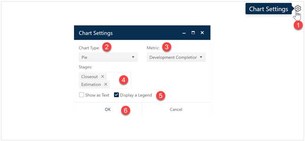
Pie charts are useful when you want to show the relative quantities or proportions of various metric values or project types in your project portfolio. They can provide a high-level overview of your portfolio by year of completion, primary responsibility, primary development language, division or organization, or keyword. To create a pie chart, go to an existing chart or report (or a blank dashboard slot) and click the Chart Settings icon. On the Chart Settings dialog, select Pie from the Chart Type combo box. The fields available for configuring will update as you select different chart types.

Next choose the Metric you wish to display on your pie chart. If desired, you can limit the data in the chart to projects in a single Stage or select both Estimate and Closeout to display data from all projects in your current project list filter. A Legend will be displayed by default – to toggle it off and display chart labels for each “pie slice”, simply uncheck the Legend field. To optimize the display, if your current dashboard is in 3-column mode, the Legend will not be displayed (regardless of the checkbox setting) and the legend key icon will be hidden until you switch to 2- or 1-column layout. When the chart settings are configured to your satisfaction, click OK to exit the Chart Settings dialog and display your new pie chart.
Rest the cursor over a given slice of the pie to see the category (slice) label and the number and percentage of projects represented by that slice. You can also display a chart and report form side-by-side on the same 2-column dashboard layout if you prefer that to showing a legend.

If you change your mind about any of the original settings,
use the Chart Icons toolbar located at the right side of the chart to
change the metric used for grouping or to limit the projects considered to those
in a particular stage. If the chart icons toolbar is not visible, you can
show/hide it using the eyeball icon ( ) in the dashboard toolbar.