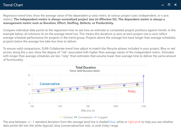
Once you’ve completed the chart setup described earlier in
this section, metric values for the projects you selected on the Project List
page will be displayed as data points on the Trend chart. The horizontal axis is
always “Size”, measured in the default unit defined by your site administrator.
Your chosen benchmarking metric will appear on the vertical chart axis, along
with an arrow indicating which direction (above or below the average regression
line) is considered “better”. Resting the cursor over the arrow, data
points, regression lines or shaded regions will display a hover tip containing
information about the selected item.
The chart interpretation
guide below will help with interpretation of various chart elements.
