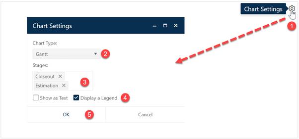
Gantt charts plot the durations for individual projects as a series of bars along a timeline (horizontal axis). They can be helpful in visualizing organizational workflow (number of projects in progress) at various points in time. Pausing the cursor over any individual project bar will cause a hover tip to display the project name and start/end dates. To create a Gantt chart, go to an existing chart or report (or a blank dashboard slot) and click the Chart Settings icon. On the Chart Settings dialog, select Gantt from the Chart Type combo box. The fields available for configuring will update as you select different chart types.

If desired, you can limit the data in the chart to projects in a single Stage or select both Estimate and Closeout to display data from all projects in your current project list filter. Use the Show as Text checkbox to toggle between chart and report forms of the Gantt object. The Legend checkbox toggles the display of a project stage legend on or off. When the chart settings are configured to your satisfaction, click OK to exit the Chart Settings dialog and display your new Gantt chart or report.

If you change your mind about any of the original settings,
use the Chart Icons toolbar located at the right side of the chart to
limit the projects considered to those in a particular stage. If the chart icons
toolbar is not visible, you can show/hide it using the eyeball icon ( ) in the dashboard toolbar.