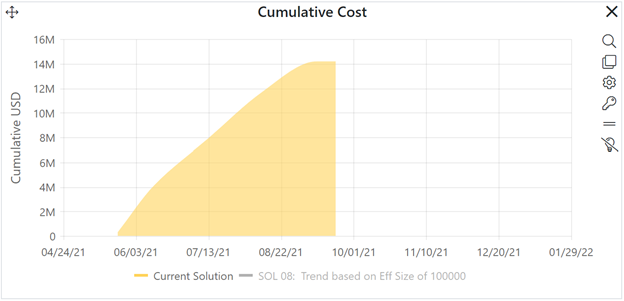
Comparison charts allow you to graphically compare values for a single metric across multiple solutions. The same color scheme (current solution: yellow, balanced risk solution: green, logged solutions: blue) is used. In this example, the current solution Duration is higher than the Balanced Risk or Solution 01 (a previously logged solution). You can easily display other Phase 3 or Lifecycle (total) metric values by clicking the Chart Settings (gear) icon in the chart icons toolbar and selecting the desired metric from the Metric drop down combo box. You can toggle the chart to report form using the Show as Text checkbox.
