Comparison Charts

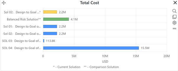
Comparison charts are only available on Estimation dashboards. Comparison charts allow you to graphically compare values for a single metric across multiple solutions associated with a single project. Current solution bars are yellow, the balanced risk solution is green, and logged solutions are shown as blue bars.


 Description: Graphical user interface, application, table

Description automatically generated


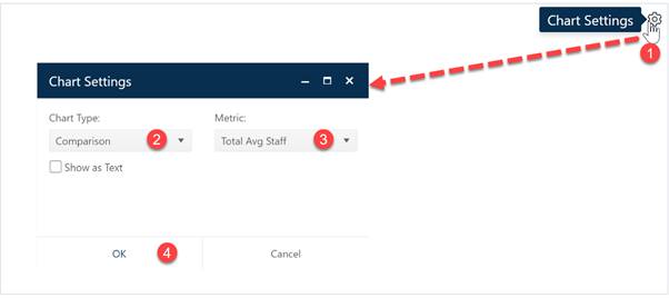
To create a Comparison chart, go to an existing chart or report (or a blank dashboard slot) and click the Chart Settings icon.  On the Chart Settings dialog, select Comparison from the Chart Type combo box.  The fields available for configuring will update as you select different chart types.


Description: Graphical user interface, application

Description automatically generated


Next choose the Metric you wish to display on your Comparison chart. Finally, decide whether you wish to display the chart or report form (Show as Text).  When the chart settings are configured to your satisfaction, click OK to exit the Chart Settings dialog and display your new Comparison chart.


Description: Graphical user interface, application

Description automatically generated


If you change your mind about any of the original settings, use the Chart Icons toolbar located at the right side of the chart to change the metric displayed adjust other chart settings. If the chart icons toolbar is not visible, you can show/hide it using the eyeball icon (Description: A picture containing icon

Description automatically generated ) in the dashboard toolbar.