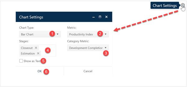
A bar chart shows the average value for various numeric metrics (PI, Cost, Defects, Labor Rate) for projects grouped into “bars” using a second category metric (FOC year, stage, or another characteristic). To create a bar chart, go to an existing chart or report (or a blank dashboard slot) and click the Chart Settings icon. On the Chart Settings dialog, select Bar Chart from the Chart Type combo box. The fields available for configuring will update as you select different chart types.

Next choose the numeric metric you would like to evaluate (Metric) and the metric used to group the data into category bars (Category Metric). If desired, you can limit the data in the chart to projects in a single Stage or select both Estimate and Closeout to display data from all projects in your current project list filter. Use the Show as Text checkbox to toggle between chart and report forms of the bar chart object. When the chart settings are configured to your satisfaction, click OK to exit the Chart Settings dialog and display your new bar chart or report.

If you change your mind about any of the original settings,
use the Chart Icons toolbar located at the right side of the chart to
change the metrics used for averaging or grouping or to limit the projects
considered to those in a particular stage. If the chart icons toolbar is not
visible, you can show/hide it using the eyeball icon ( ) in the dashboard toolbar.